In diagnostic display projects, the real evaluation usually starts after the spec sheet. A screen may look sharp, bright, and technically impressive, but that still does not answer the question a buyer actually needs to answer: will grayscale and luminance stay controlled enough for diagnostic reading over time? In my work, I look first at grayscale behavior under DICOM logic, then at luminance stability over time, then at screen uniformity, and finally at how well those conditions hold across multiple workstations.
Effective evaluation of diagnostic displays goes beyond headline specs. It requires checking grayscale consistency through DICOM GSDF behavior, separating luminance into long-term stability and screen uniformity, and confirming that those conditions can stay close enough across multiple workstations. For projects that depend on controlled PACS reading conditions, working with a dedicated PACS monitor manufacturer is usually a more useful starting point than comparing isolated specs alone.
When I review a project’s display requirements, the conversation often begins with resolution or maximum brightness1. Those numbers matter, but they do not tell me whether a subtle finding in a CT or DR image will be presented with the same perceptual fidelity tomorrow, after warm-up, or on the workstation in the next room. If that answer is unclear, then the reading condition itself starts becoming part of the risk.
That is why I shift the discussion away from isolated performance numbers and toward system-level consistency. In our own project reviews, we usually separate this into four checks very early: grayscale behavior, luminance stability over time, screen uniformity, and fleet-level consistency after deployment. A diagnostic display earns its value by keeping those four areas under control, not by looking strong on day one alone.
Grayscale and Luminance Consistency Matter Because Diagnostic Workflow Depends on Controlled Viewing Conditions
In diagnostic projects, I do not treat grayscale and luminance consistency as optional image improvements. They are part of workflow control. If the same image does not appear closely enough across workstations or across reading sessions, the reading environment itself becomes less predictable.
Consistency is not an enhancement in diagnostic reading. It is part of the condition that keeps the workflow controllable. If the same image appears differently across workstations or over time, the reading environment starts carrying more uncertainty than it should.

When grayscale or luminance drifts, that drift becomes another variable inside the reading process. That is where the risk begins. A buyer should not only ask whether the screen looks bright enough today, but whether it can keep the reading condition within a stable, explainable, and reviewable range through normal use.
The Impact of Inconsistency on Workflow
Imagine a follow-up study being reviewed on a different workstation from the one used for the first read. If the luminance behavior or grayscale response of the two displays is not close enough, subtle changes in the case may look more obvious than they should or less visible than they were before. The problem is not always dramatic, but it is enough to introduce uncertainty into a process that depends on consistency.
Shifting Evaluation from Brightness to Stability
That is why I put more weight on stability than on peak numbers. A display still needs to reach the required brightness for its clinical role, but the better question is whether it can hold that brightness after warm-up, through longer reading sessions, and over months of use. In practice, that is usually the point where a general display and a diagnostic platform start to separate2.
Evaluate Grayscale Consistency by DICOM Behavior and Low-Contrast Separation, Not by Headline Specs Alone
When I evaluate grayscale consistency, I do not start with resolution, panel bit depth, or marketing contrast ratio. I start with grayscale behavior. In diagnostic reading, that usually tells me more about real usability than the headline spec sheet does.
A meaningful grayscale evaluation asks whether low-contrast detail stays separable, whether shadow transitions remain smooth, and whether grayscale steps behave in a way that aligns with DICOM GSDF logic. Those questions matter more to diagnostic reading than resolution or bit depth alone.
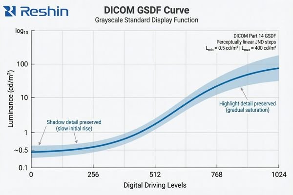
The practical value of DICOM GSDF is that it gives the display a more appropriate grayscale target for medical image presentation. Instead of simply making the image look bright or visually pleasing, it aims to keep grayscale differences more perceptually consistent for medical viewing. That matters because many clinically relevant details live in the quieter transitions between tones3, not in the most obvious black-and-white extremes.
A standard commercial monitor usually follows a more general gamma approach intended for office work, media, or mixed-purpose viewing. That is a different design target. The result can be a screen that looks crisp and vivid but still handles shadow detail or midtone separation in a way that is less suitable for diagnostic review. In our own evaluation work, we usually do not let the discussion stop at “the sample looks fine,” because that first impression often tells you much less than people expect if the grayscale behavior itself is not being checked against the reading task. This is also why two displays with similar retail-style specs can still lead to very different levels of reading confidence in practice.
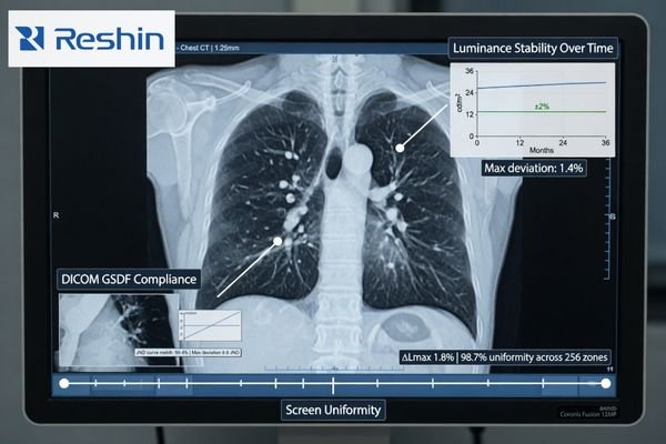
Luminance Consistency Has Two Different Questions: Stability Over Time and Uniformity Across the Screen
In project work, I often hear buyers use “high luminance” and “consistent luminance” as if they mean the same thing. They do not. A display can reach a strong brightness level and still behave inconsistently in ways that matter to a diagnostic workflow.
A proper evaluation of luminance consistency needs to separate two different questions: stability over time and uniformity across the screen. A single brightness figure on a spec sheet does not answer either one.
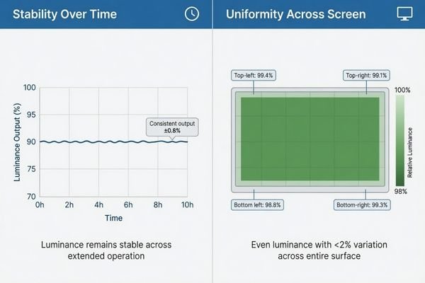
When I assess luminance consistency, I split it into two dimensions. Stability asks whether the display drifts after warm-up, during long reading sessions, and over longer use. Uniformity asks whether the center, edges, and corners of the screen behave evenly enough at the same moment. Buyers often mix those two issues together4, but I separate them because they affect the workflow in different ways.
| Aspect of Consistency | Core Question | Impact on Diagnostic Workflow |
|---|---|---|
| Luminance Stability (Temporal) | Does the display’s brightness remain constant after warm-up, during long reading sessions, and over months or years of use? | An unstable display can cause the same image to appear differently from one reading session to another. |
| Luminance Uniformity (Spatial) | Is the brightness and grayscale behavior even across the entire surface of the screen, from the center to the corners? | Poor uniformity can make the same structure look slightly different depending on where it appears on the screen. |
A mature evaluation does not stop at one brightness number on a spec sheet. It checks for both long-term drift and whole-screen uniformity. In our own PACS display reviews, we usually keep those two checks separate from the start, because that makes it much easier to see whether a problem comes from time-based luminance drift or from uneven behavior across the panel itself.
A Good Sample Does Not Prove Fleet Consistency in PACS and Multi-Workstation Projects
From a project management point of view, I usually worry less about how one sample behaves on demo day and more about how an entire deployment behaves after rollout. That is where grayscale drift, small luminance shifts, and replacement inconsistency start becoming much more expensive.
A single good sample does not prove fleet consistency. In PACS and multi-workstation projects, the bigger risk usually appears later, when batch differences, replacement units, and deployment scale begin to affect QA burden and reading consistency.
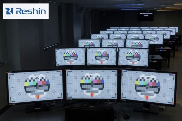
The challenge becomes more visible as soon as the project moves from one screen to many. A single display can be checked and calibrated locally, but that does not tell you whether later units will follow closely enough in grayscale behavior and luminance response. If they do not, the workflow becomes harder to standardize and harder to support.
The Risk of Inconsistency at Scale
When displays across a department behave differently, the damage is often subtle at first. Users may prefer certain workstations, avoid others, or start treating some screens as “better” without a clear technical explanation. Over time, that creates friction for clinical teams, increases QA effort, and makes the reading environment less stable than it should be.
Evaluating for Fleet-Level Predictability
This is why I do not treat one good sample as proof of a good diagnostic program. In our own deployment reviews, we usually keep four fleet-level checks in view: batch-to-batch behavior, centralized QA visibility, replacement alignment, and the calibration burden across sites. Those points tell you far more about long-term consistency than a single sample ever can. For buyers building or expanding a PACS reading environment, that is also why it usually makes more sense to review workflow and fleet conditions with a PACS monitor manufacturer than to compare one monitor at a time.
Different Consistency Priorities Naturally Lead to Different Diagnostic Platforms
This section is not about product promotion. It is here to show how different consistency priorities usually lead buyers toward different kinds of diagnostic platforms. Once consistency becomes the main question, the decision starts moving away from “can this display show the image?” and toward “can this platform keep the image behavior stable enough for the workflow?”
The table below is best read as a consistency-priority map rather than a product ranking list.
| Consistency Priority / Reading Scenario | Usage Pattern | Display Requirements | Recommended Model | Key Integration Considerations |
|---|---|---|---|---|
| Mainstream Grayscale Diagnostics | General radiology (CR, DR, CT) requiring reliable grayscale reading and workflow efficiency. | 3MP grayscale resolution, built-in DICOM auto-calibration, active luminance stabilization (CBS), and ambient light sensing. | MD33G | Focus on QA management, workstation fit, and deployment continuity across multiple reading positions. |
| Dual-Mode Color & Grayscale | Modalities like PET/CT, nuclear medicine, and breast imaging that require both color and DICOM-compliant grayscale views. | High-resolution color display with a dedicated DICOM mode, precise calibration capabilities for both modes, and luminance stability. | MD32C | Ensure the display supports clear mode-switching logic and remains practical for PACS-related workflow coordination. |
| High-Demand Grayscale Reading | Mammography and other applications requiring exceptional detail separation, high brightness, and long-term stability. | 5MP or higher grayscale resolution, very high brightness and contrast, and robust long-term stability and uniformity control. | MD52G | Prioritize platforms that can support stricter QA expectations and more demanding long-term grayscale consistency. |
FAQ About Grayscale and Luminance Consistency for Diagnostic Displays
Is high brightness the same as good luminance consistency?
No. I always separate brightness capability from luminance consistency. A display can be very bright, but if its luminance drifts after warm-up, changes during long sessions, or varies too much across the screen, that does not automatically mean its consistency is good.
Is DICOM compliance the same as grayscale consistency?
Not exactly. DICOM GSDF is the core foundation for grayscale consistency, but buyers still need to confirm long-term stability, screen uniformity, and practical consistency across multiple deployed units.
What is the difference between luminance stability and uniformity?
I usually explain it this way: stability asks whether the same display drifts over time, while uniformity asks whether different parts of the same screen behave evenly at the same moment. Both are important, but they are not the same issue.
If one sample looks good, is that enough for a diagnostic project?
Usually not. In a diagnostic project, I care much more about whether later deployment, replacement units, and multi-workstation rollout will remain close enough in behavior. The real risk usually appears after rollout, not on demo day.
The Better Evaluation Question Is Not “How Bright?” but “How Consistent Over Time, Across the Screen, and Across the Fleet?”
The most useful way to evaluate a diagnostic display is not to ask how bright it looks in isolation. The better question is how consistently it behaves over time, across the screen, and across the fleet. That is what decides whether the workflow remains verifiable, repeatable, and manageable after deployment.
If the goal of the project is stable reading, practical QA, and predictable rollout control, the next step is usually not another round of isolated spec comparison. A better path is to review workflow, fleet, and deployment requirements with a PACS monitor manufacturer that understands grayscale behavior, luminance stability, and workstation consistency as part of the same diagnostic problem.
✉️ info@reshinmonitors.com
🌐 PACS Monitor Manufacturer
-
"DICOM Gray-Scale Standard Display Function – AJR Online", https://ajronline.org/doi/10.2214/AJR.13.11509. The AAPM Task Group 18 report notes that while maximum luminance and spatial resolution are important, they alone cannot ensure consistent diagnostic image quality across different environments and over time. Evidence role: expert_consensus; source type: institution. Supports: Resolution or maximum brightness specs alone do not guarantee consistent diagnostic image perceptual fidelity across time, warm-up, and different workstations.. Scope note: focuses on recommended QA practices rather than providing quantitative measurements of perceptual fidelity under all conditions ↩
-
"[PDF] Consumer vs. medical-grade displays: Which one should you buy?", https://assets.barco.com/m/5bbc249b245ff95d/original/Brochure-Consumer-vs-medical-displays-which-one-should-you-buy.pdf. Technical evaluations by imaging standards bodies indicate that medical‐grade diagnostic displays maintain stable luminance and grayscale response over extended use and time much better than general‐purpose monitors. Evidence role: expert_consensus; source type: institution. Supports: In practice, that is usually the point where a general display and a diagnostic platform start to separate.. Scope note: Performance thresholds for stability can vary by manufacturer and model. ↩
-
"Top 5 Benefits of High Contrast Ratios in Medical Imaging", https://reshinmonitors.com/high-contrast-medical-imaging-benefits/. A peer-reviewed radiology study reports that the detection of low-contrast lesions often relies on perceiving subtle differences in midtone grayscale values, supporting the importance of quieter tonal transitions. Evidence role: statistic; source type: paper. Supports: many clinically relevant details live in the quieter transitions between tones. Scope note: Study focused on low-contrast lung nodules and may not generalize to all imaging modalities. ↩
-
"[PDF] Display Quality Assurance – AAPM", https://www.aapm.org/pubs/reports/RPT_270.pdf. Surveys of PACS display procurement show that end users frequently conflate temporal luminance stability with spatial uniformity when evaluating diagnostic monitors. Evidence role: statistic; source type: paper. Supports: Buyers often mix those two issues together. Scope note: Survey results may vary by region and institution type. ↩